
KakaoTalk- Case Study
Redesigning and creating a new feature on an existing mobile messenger app to help enhance communication.
About
Currently, KakaoTalk is one of the most popular messaging services in Korea of all age groups. As a service my community and I use daily, I decided to redesign the mobile application to address user needs and pain points.
Challenge
KakaoTalk is deeply rooted as a medium of conversation and communication. The biggest challenge was to think of a solution to how I can enhance better user experience and integrate a feature to help connect more frequently and easily with friends and family.
User Research
Through conducting user interviews, a few KakaoTalk users mentioned that they didn’t consider chatting with a friend or family unless there was a need or purpose. I also learned that younger generations felt most connected with their friends when viewing and interacting with their friends’ 24-hr story. And while most younger generations were aware of how to use this story feature, many older generations were not familiar with it. With the current KakaoTalk service serving as a basic chatting medium, it wasn’t taking full advantage of helping connect with one another.
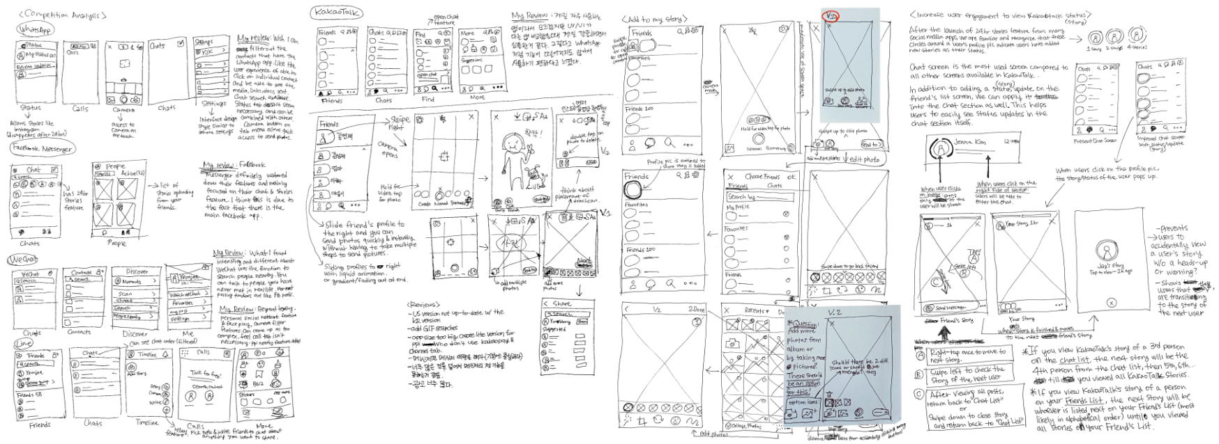
Sketches
From here, I began the ideating process, taking inspiration from existing messenger platforms, and playing around with new design patterns. I sketched out several ideas in different variations to establish how the user flow would be more smooth and efficient.
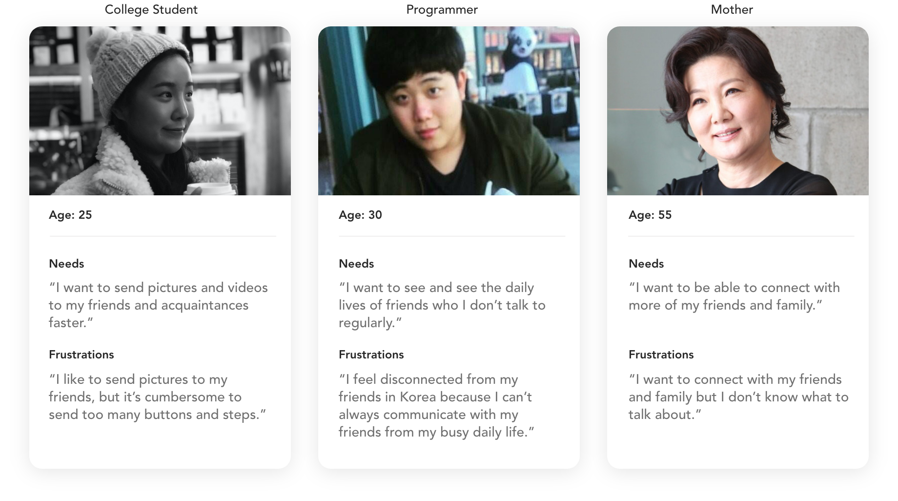
Personas
As I began to narrow into the problem, I identified three distinct user personas who would be in favor of the new design.
Increase User
Engagement with a
24-hr Story Feature
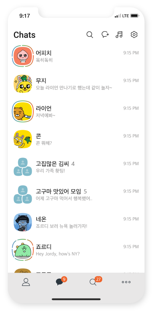
With the collected data, it was evident that people love to use a 24-hr story feature to communicate with friends. Being able to reply to stories became a good ice-breaker that allowed users to start a conversation. Having a story post feature will support more personal and intimate communication.
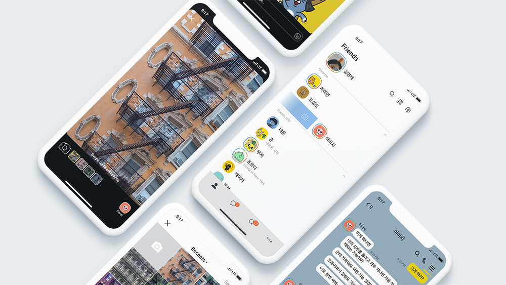
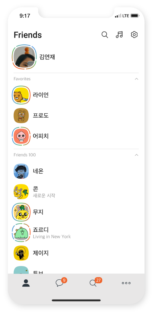
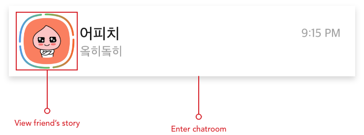
The circles around the users’ profile pic indicate how many stories have been uploaded.
A/B Testing for
Story Features
An A/B testing for the story feature helped me start identifying what worked better and what users felt most comfortable with.
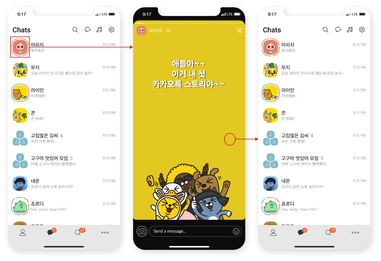
Variation A:
When clicked on a selected friend’s profile pic, it takes user to the story
uploaded by the friend.
Right-tap once to see next story.
After viewing all posts of the selected friend, it takes user back to
the Chat List.
Variation B:
When clicked on a selected friend’s profile pic, it takes user to the story
uploaded by the friend.
Right-tap once to see next story.
Swipe left on screen “B” to be taken to screen “C”.
OR
After viewing all posts of the friend, it takes user to screen “C”.
Tap on screen “C” to view story of the next friend.
OR
Click the X button on screen “C” to close story and return back to the Chat
List.
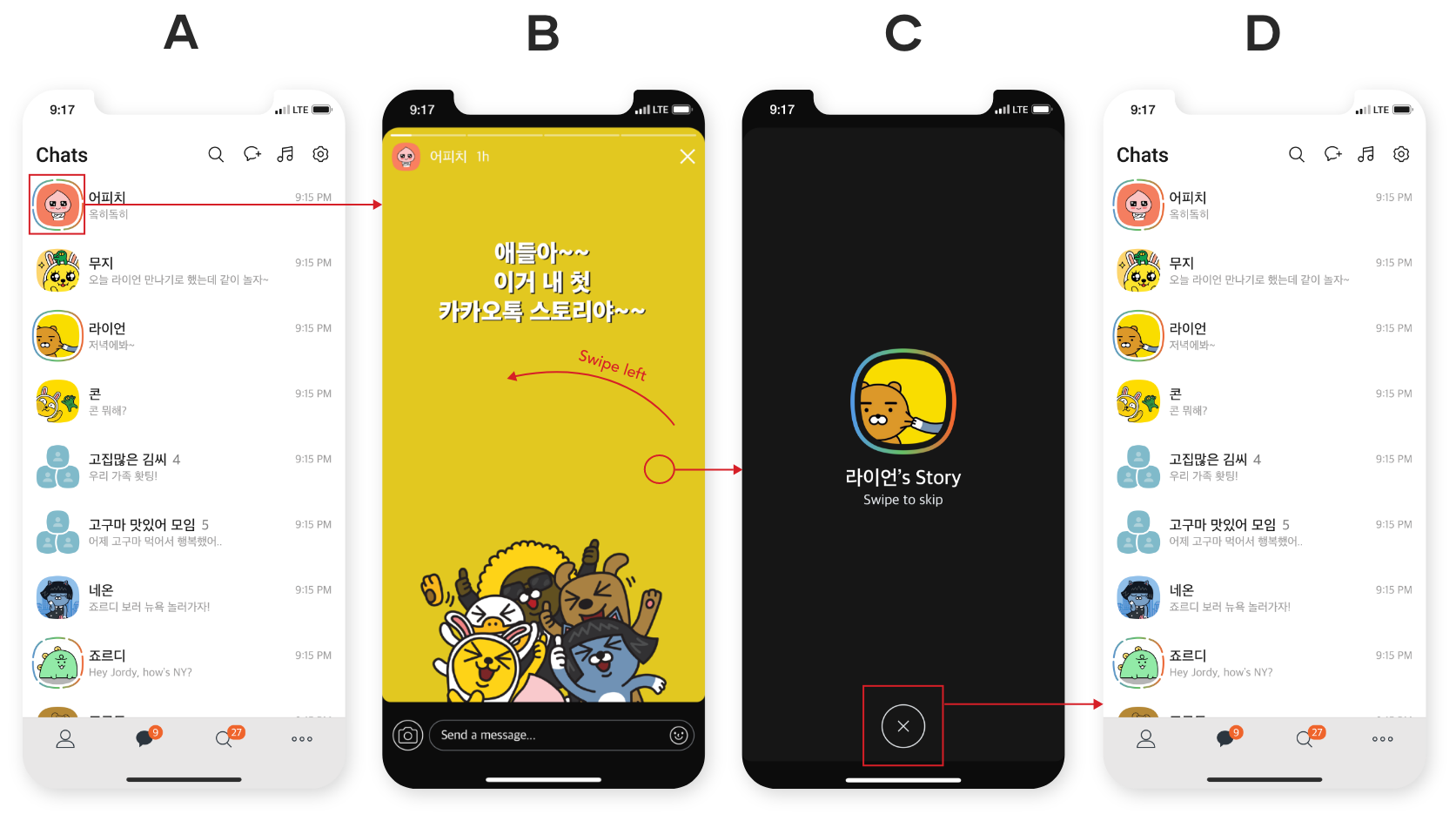
Through an A/B testing, users preferred Variation B. Variation B alerts users that the user will be transitioning to the story of the next user. This prevents users to accidentally view the next friend’s story without a heads-up or warning.
Redesigning for a
Quicker Way of
Sending Photos
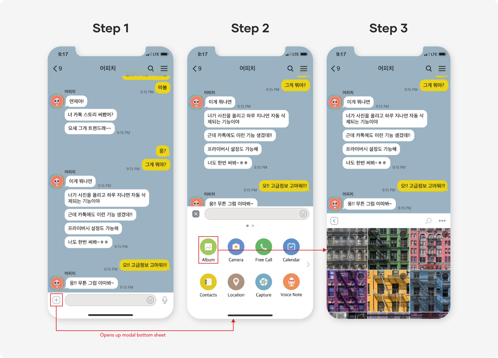
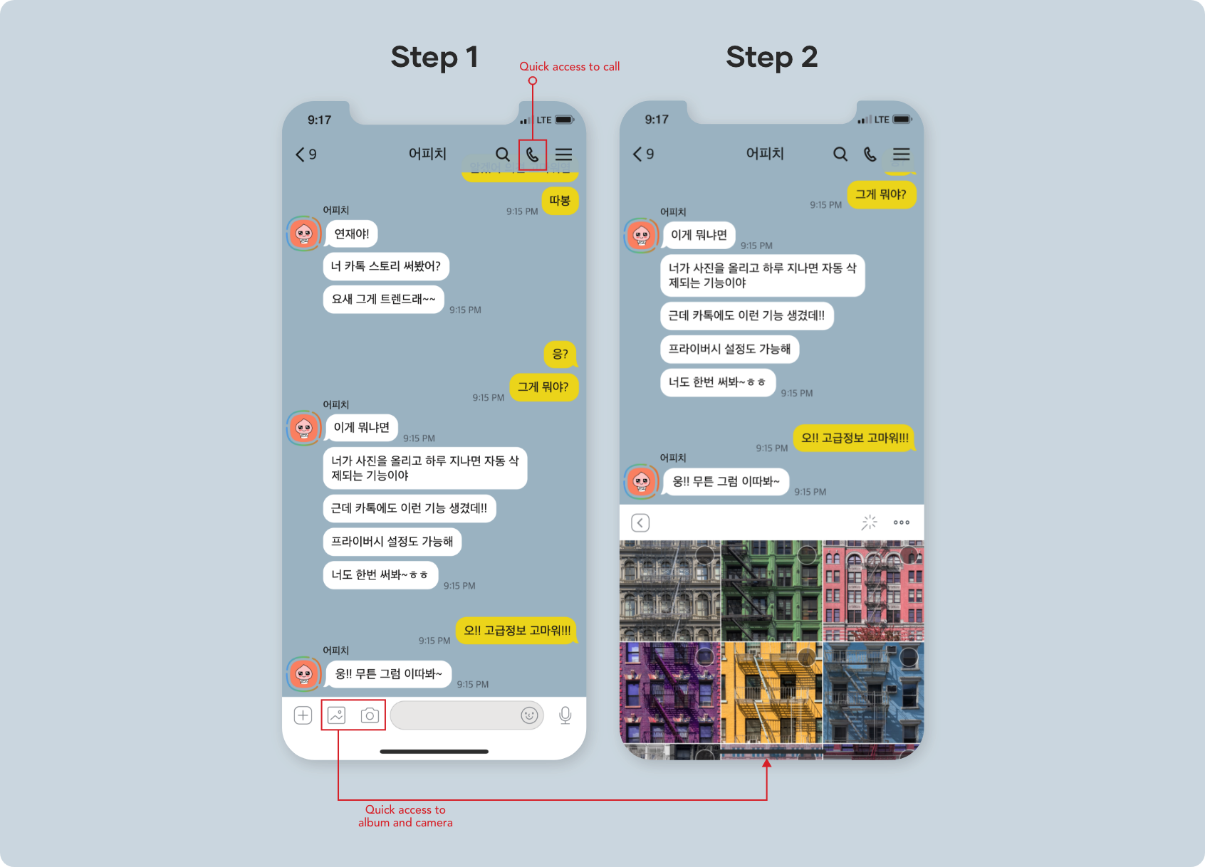
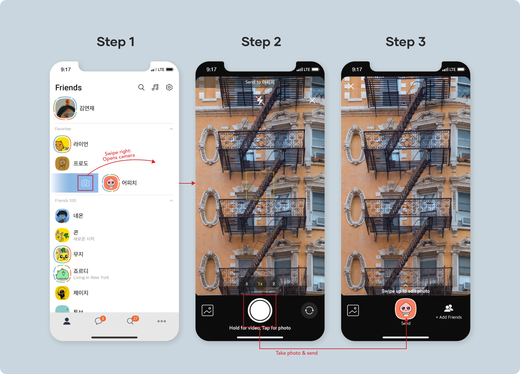
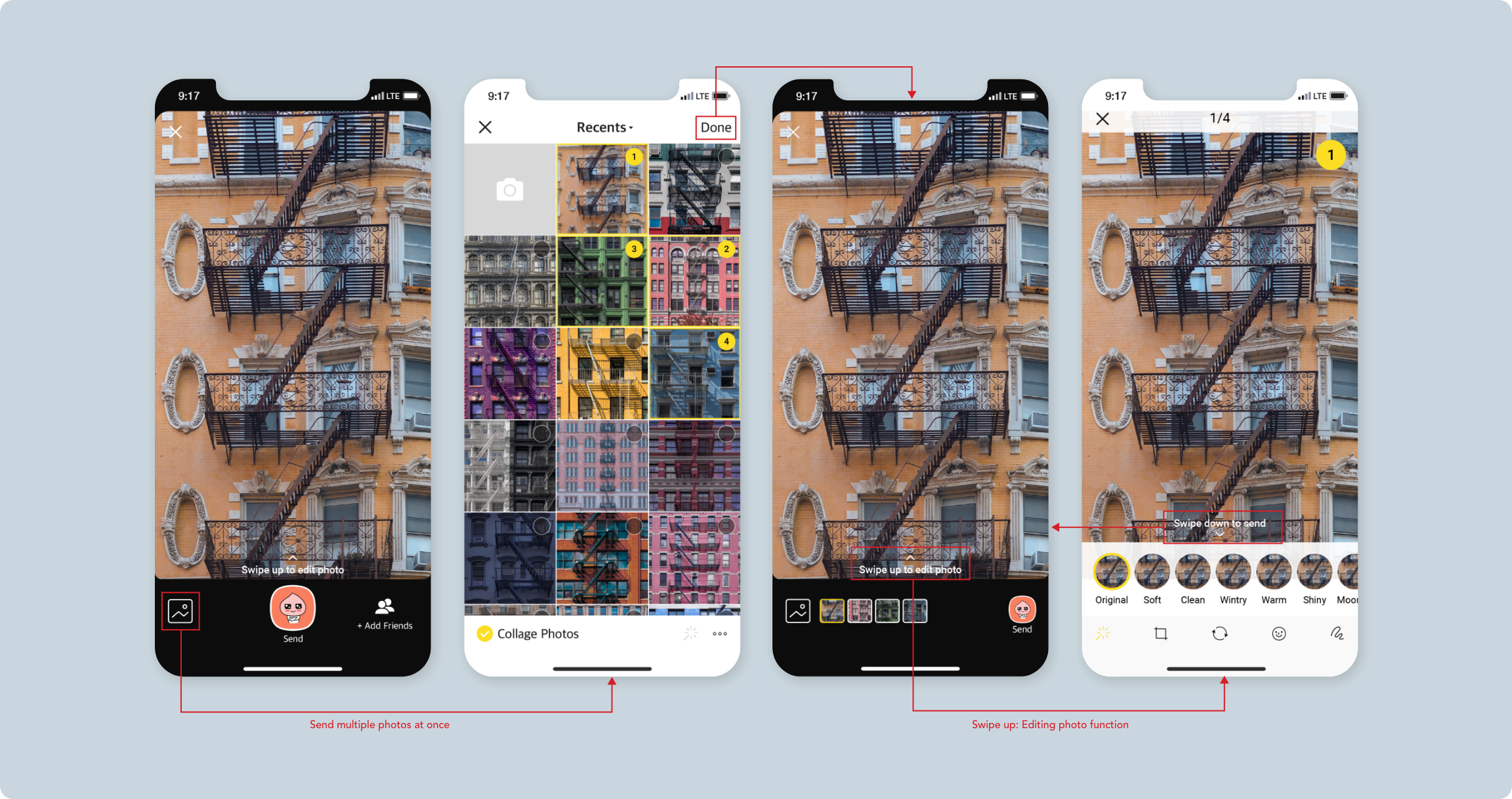
One pain point that I had users encounter with KakaoTalk was that it took too many steps to send a photo to a friend. To solve this problem, I redesigned the interface so that steps are reduced.
Conclusion
Yes, a 24-hr story is not something new however, my final prototype was not to drastically redesign KakaoTalk to accommodate a new feature but to create an already-in-market feature that could be integrated into the app’s interface. As KakaoTalk has become an indispensable application in the lives of Koreans, I wanted to make it possible for users to have a more personal and more intimate conversation.
What I Learned
This project taught me the different methods of user research. It was satisfying to see how research through multiple methods showed me different data. I was able to dive deep into the problem with validation from the users. This added credibility to the decisions I made when redesigning and creating a new feature.