Dermatologist- Case Study
Rebranding and redesigning World’s Famous Dermatology site for easy navigation and to create an identity of reliability.
About
World’s Famous Dermatology is a leading dermatology and skincare center in Georgia that focuses on medical as well as cosmetic dermatology.
Challenge
World’s Famous Dermatology is a local clinic that has been around for a long time with an out-dated website. Its website did not have all the features a patient fully needs. The challenge was to build a platform that provided easy navigation while creating trust for new patients. To establish this goal, World’s Famous Dermatology needed a brand redesign.
Research
To begin my research, I started to look at a few competitors or similar platforms, analyzing UI, UX, User flow, IA, and key features. Through this, I was able to identify the features the World’s Famous Dermatologist’s site lacked and create a solution.
Problem & Approach
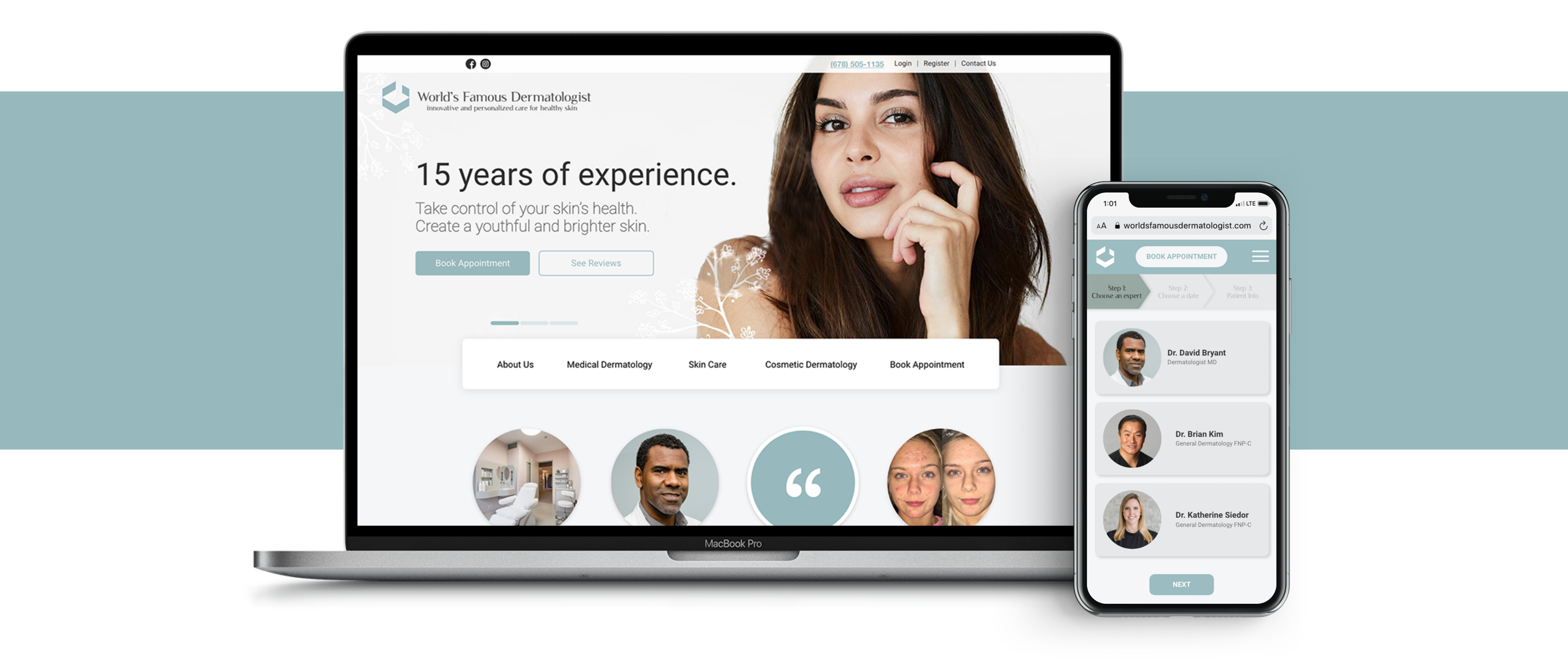
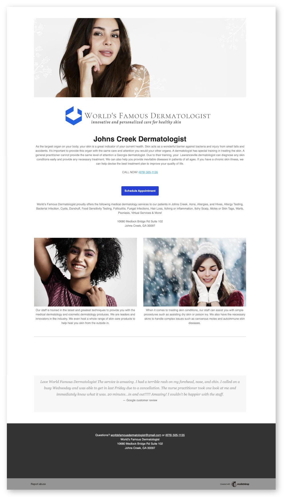
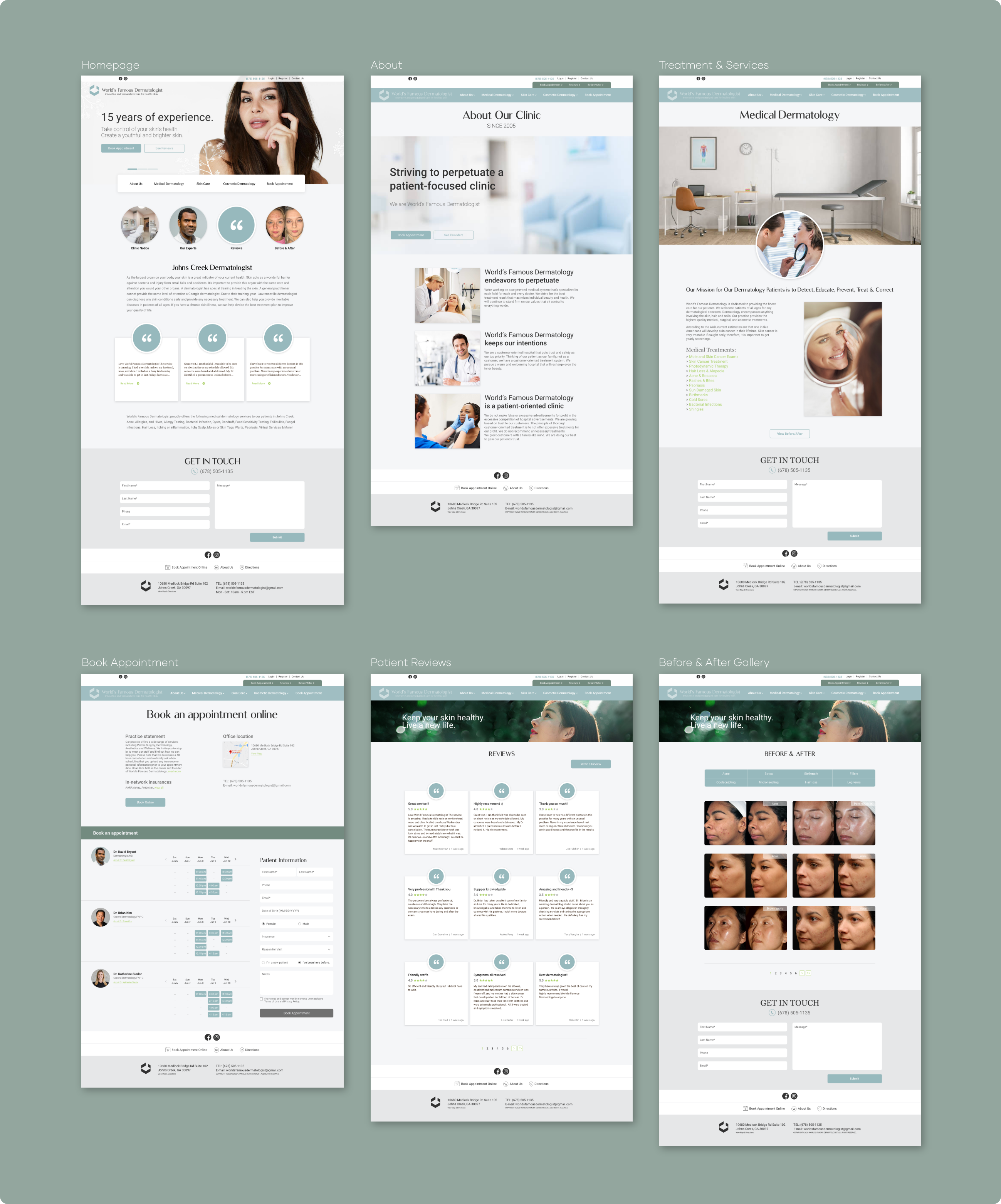
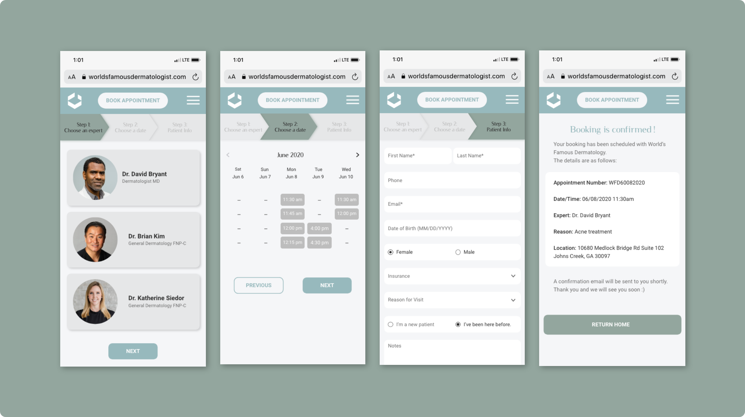
Overall, the previous website was a one-page that was poorly made and lacked content to help new patients build reliance on the clinic. I focused on the task of creating a patient-oriented site. I built in new features such as a page of patient reviews, a page of about the clinic, and a gallery of before & after treatments. Most importantly, I made sure that the website had a clear and visible contact number and a call-to-action button to help patients book appointments effortlessly.
Brand Design
I considered how I can rebrand the site to create an identity of the World’s Famous Dermatology to be reliable, elegant, and refreshing.
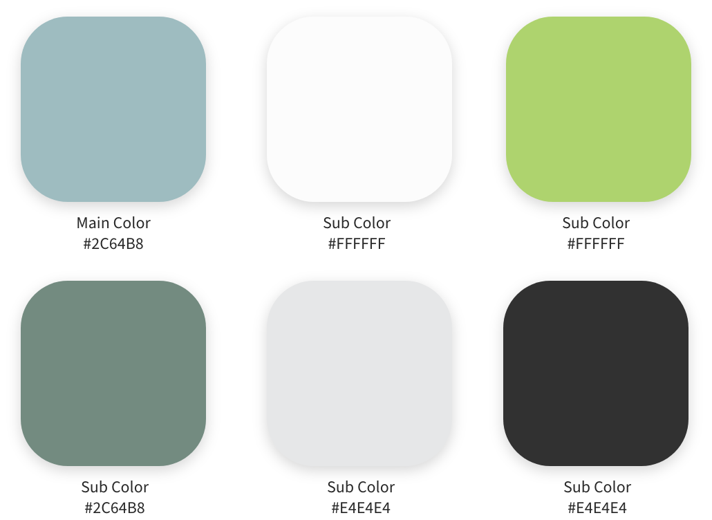
Color Palette
I used a mix color of blue and green to associate the feeling of loyalty and freshness.
Typography
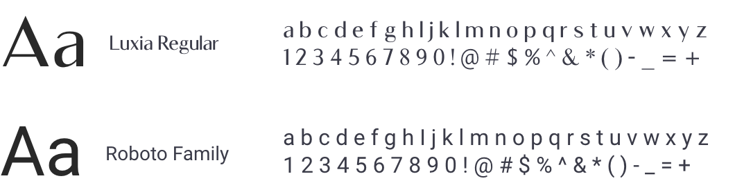
Luxia font was used to show elegance and the Roboto font was used for simplicity.
Conclusion
The final prototype of the website was redesigned and rebranded. The prototype created the potential for an increase in website engagement and to form reliance and trust in new patients. Ultimately, the new design helped encourage easier appointment bookings online.
What I Learned
I learned there is really no limit to the design process, nor is it defined by one particular model or representation. Although I used other competitor platforms to guide me, I learned to craft my own way of thinking, prototyping and designing. This project helped me think critically about the flow and the needs of the user.
What I Would Have
Done Differently
What I would have different would be to remove the 'get in touch' at the bottom of the page and change it to 'book appointment online'. I feel that the 'get in touch' wording can confuse the user between the option of 'booking an appointment'.